
If you’re in the middle of doing up your home, you might already be familiar with the Unexpected Red Theory. But for the benefit of those not currently addicted to scrolling paint colours on Pinterest, allow me to fill you in…
Coined by Brooklyn-based interior designer Taylor Migliazzo Simon earlier this year in a now-viral TikTok video that’s been viewed more than a million times, she explains; “The unexpected red theory is basically adding anything that’s red, big or small, to a room where it doesn’t match at all, and it automatically looks better.”
She goes on to show various visual examples, such as a pair of scarlet sinks in a teal-tiled bathroom or a feature mirror set within a ruby-red frame. “I’m petitioning to make red a neutral colour,” she continues, “because it just looks good with everything.” The design world was quick to sit up and take note, with TikTok’s amateur interiors enthusiasts marvelling over what a difference a tomato-red vase can make to a dingy corner of your living room.
Now, I love soft furnishings as much as the next millennial, so this got me thinking: can the Unexpected Red Theory be applied to what we wear as well as how we furnish our homes?
To test the theory, one must consult the best-dressed people on the planet (let’s start with the attendees at Copenhagen Fashion Week). There—a place where the clothes on the runway are no match for the outfits paraded by the street style elite—expertly deployed shocks of scarlet were as ubiquitous as walkable shoes and portable phone chargers.

Perhaps this should come as no surprise. For centuries, women have lauded the power of a slick of red lipstick or glossy nail polish. Red is the colour of power and passion. Danger, energy and confidence. However, what makes the 2024 viral iteration different is that it’s all about how you wear it. For the Unexpected Red Theory to work, you need just one small item, something intentionally odd and designed to draw the eye. As the name suggests, the more unexpected, the better. Say, for example, a pair of ruby-red ballet flats with an all-navy outfit. A crimson leather belt instead of black. Or a giant scarlet scrunchie.
“The colour red is rich and intense, so you don’t need to load it on to make an impact,” says fashion-turned-interior designer Matthew Williamson, aka the king of colour. In his recent book, Living Bright—a love letter to colour-drenched maximalism—he advises less is more when it comes to the fiery hue. “Rather than using it as a top-to-toe colour, I use it with restraint to highlight and draw attention to an accessory or piece of furniture that I particularly want to stand out. A single piece picked out in red can do wonders for the space.”

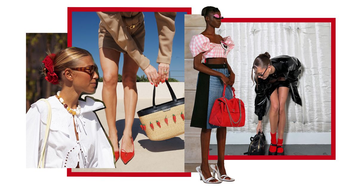
(Image credit: Launchmetrics; Jil Sander; Stella McCartney; Jacquemus; Marc Jacobs; The Attico)
The colour red is rich and intense, so you don’t need to load it on to make an impact.
The same is true of fashion. Just as the hue is most impactful when there’s no other red in the room, one small dose can make the loudest statement—a fact that will no doubt come as music to the ears of those who believe that red isn’t their colour.
Try a bright red cap or sunglasses; knot a crimson scarf around your neck, layer a red roll neck under a crisp white button-down or try a pair of red track pants with tailoring. Don’t be tempted to double up on the red or the effect will be lost. For example, red shoes + red bag = too matchy-matchy. Instead, focus on one hero item and give it the spotlight. As for me, I favour a sock. I recently splashed out £7 on a Supima Cotton Rib pair from Arket and I reach for them whenever I need a little lift.

It’s also worth mentioning that it’s a very specific shade of red we’re talking about here. It’s pillar box. Fire engine. Lipstick. Bold, bright, full pigment, traffic-stopping red.
“The famed Vogue editor Diana Vreeland was a big advocate of the colour red in decorating,” Williamson continues, referring to an iconic picture taken of her lounging in a red dress, on a red sofa, with red curtains draped behind her. “She made many famous pronouncements on the colour, the best of which nails down just how difficult it is to find the right shade: ‘All my life I’ve pursued the perfect red. I can never get painters to mix it for me. It’s exactly as if I said, “I want Rococo with a spot of Gothic in it and a bit of Buddist temple”—they have no idea what I’m talking about. About the best red is to copy the colour of a child’s cap in any Renaissance painting.'”
Nowadays, such a shade might better be known as Little Greene’s Atomic Red or Farrow & Ball’s Romesco, created in partnership with New York Fashion Week’s bright spark Christopher John Rogers. Modern paint purveyor Lick even has a limited edition collab with Heinz on the perfect Ketchup red. Look to &Daughter’s Fionn Cashmere Foulard in Poppy Red (£165) or Damson Madder’s red ruffle Arte Reversible Tie Gilet (£45) for wearable iterations.

(Image credit: Getty Images; The Style Stalker)
Once you’ve found the perfect shade, Williamson suggests, “Use it in moderation and as a full-bodied contrast to softer shades.” It’s particularly effective when paired with monotone neutrals, like navy, cream or grey, to khaki or biscuit brown. Denim, too, is a good base for the Unexpected Red Theory—try swapping in a brick-red shoe or vermillion hair clip the next time you reach for your failsafe jeans and T-shirt combo for an instantly elevated update.
But why stop there? The Unexpected Red Theory also works with pattern (think leopard print, polka dots or stripes), as a texture (like a glossy patent-leather collar on a wool coat), or even in beauty.
Feeling brave? Try swapping your boring black opaques for sheer red tights this autumn. Just want to dabble? A pair of red enamel earrings offers a low-maintenance alternative to a red lip. And if in doubt, follow my lead—you can’t go wrong with red socks.
Shop “Unexpected Red” Pieces:

Reformation
Clara Cashmere Crew Cardigan in Cherry

LOEFFLER RANDALL
Leonie Bow-Embellished Leather Flats

&Daughter
Fionn Cashmere Foulard in Poppy

Ferragamo
Hug Bag in Flame Red

Anthropologie
Broderie Oversized Hair Scrunchie in Red

ADIDAS ORIGINALS
Country Japan Nubuck-Trimmed Leather Sneakers in Red

MANOLO BLAHNIK
Maysale 70 Buckled Suede Mules

Damson Madder
Arte Reversible Tie Gilet in Red

Arket
Supima Cotton Rib Socks in Red

Charles & Keith
Nylon Curved Metallic-Accent Shoulder Bag in Red

Lie Studio
The Hannah Drop Earrings

COS
Long-Sleeved T-Shirt in Red


