
.wpfi-post-images {
display: grid;
grid-gap: 15px;
grid-template-columns: repeat( auto-fit, minmax( 10px, auto ) );
}
.wpfi-post-images img {
display: block;
}
.wpfi-post-images–no-margin {
grid-gap: 0 !important;
}
@media( max-width: 1024px ) {
.wpfi-post-images–offset {
grid-template-columns: minmax( 10px, 1fr );
grid-gap: 25px;
}
.wpfi-post-images–offset > * {
width: 85%;
margin: 0 auto;
}
.wpfi-post-images–offset > *:first-child,
.wpfi-post-images–offset > *:last-child {
width: 55%;
}
.wpfi-post-images–offset > *:first-child {
margin-left: 0;
}
.wpfi-post-images–offset > *:last-child {
margin-right: 0;
}
}
@media( min-width: 1025px ) {
.wpfi-post-images–offset {
grid-template-columns: minmax( 10px, 4fr ) minmax( 10px, 7fr ) minmax( 10px, 4fr );
}
.wpfi-post-images–offset > *:last-child {
-webkit-align-self: flex-end;
align-self: flex-end;
}
.wpfi-post-images–staggered-columns div:nth-child( 3n-2 ),
.wpfi-post-images–staggered-columns a:nth-child( 3n-2 ) {
grid-column: 1 / span 2;
}
}
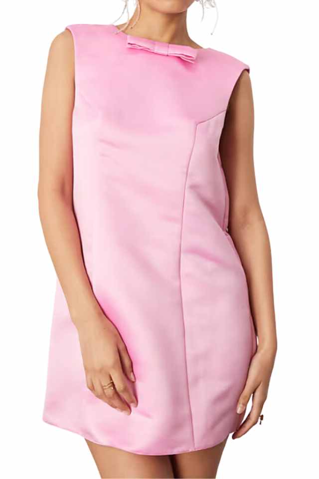
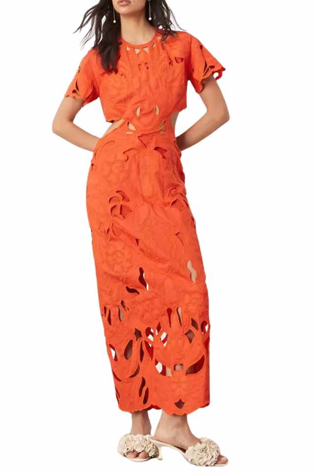
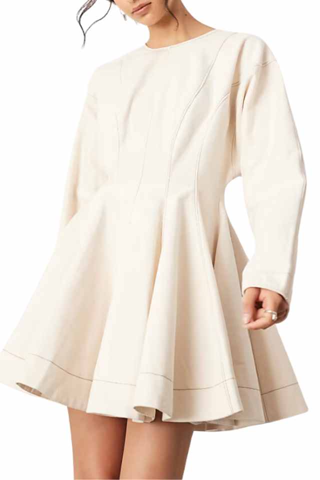
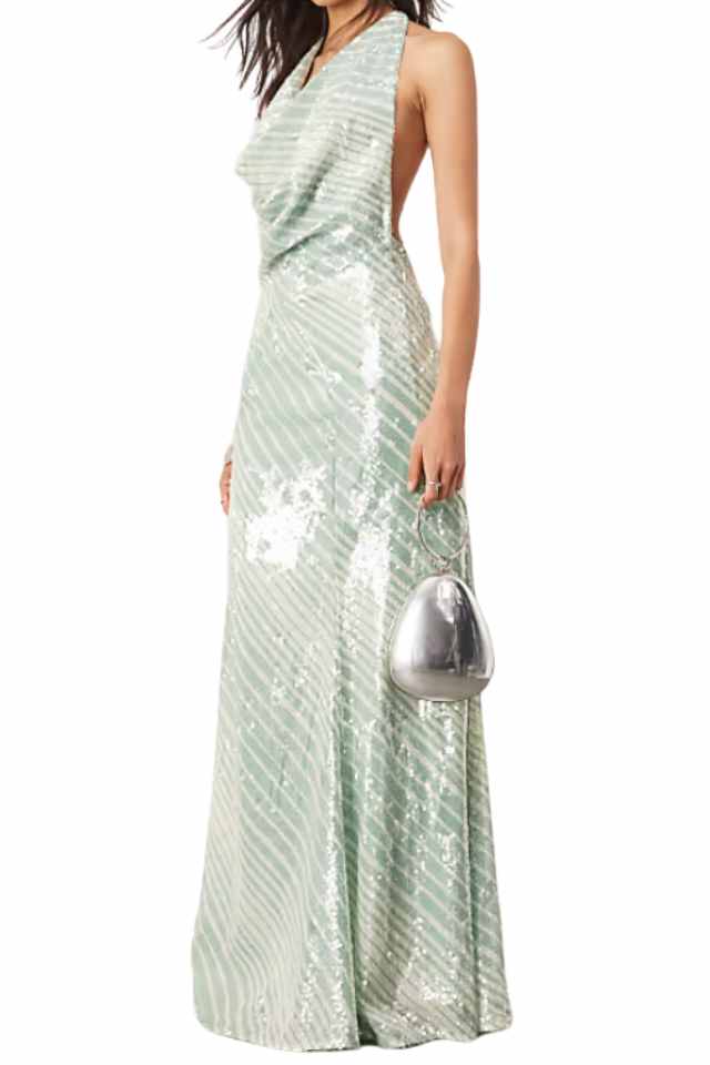
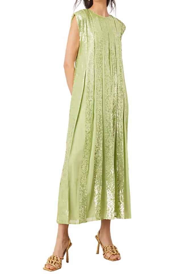
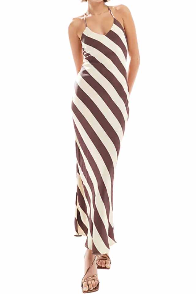
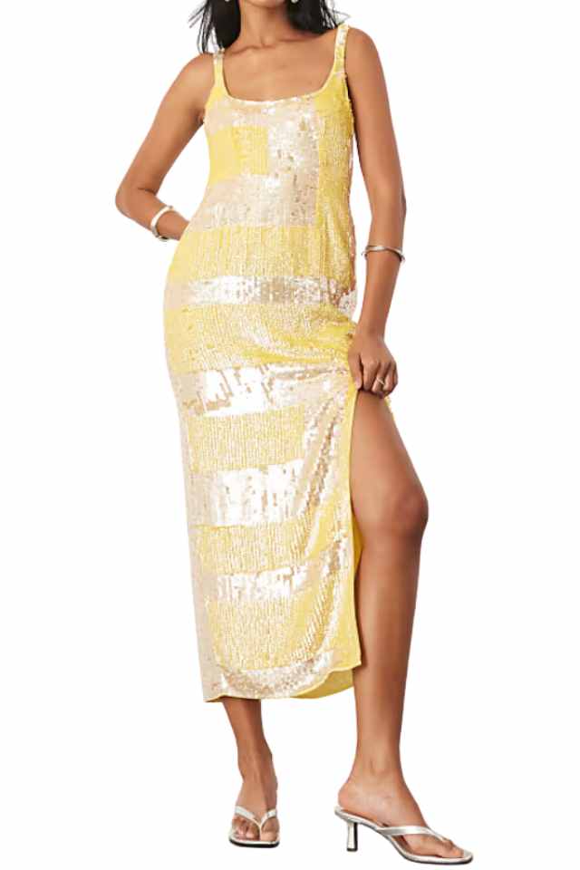
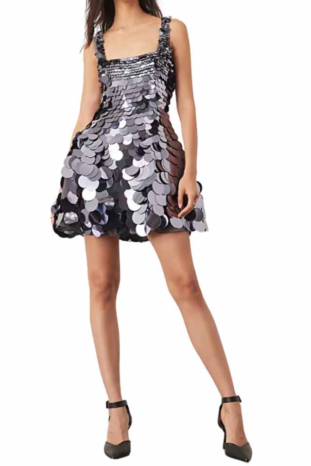
DRESS ONE worn with these shoes, this bag and these sunglasses // DRESS TWO worn with this bag and these earrings // DRESS THREE worn with these cuffs, these shoes and these earrings
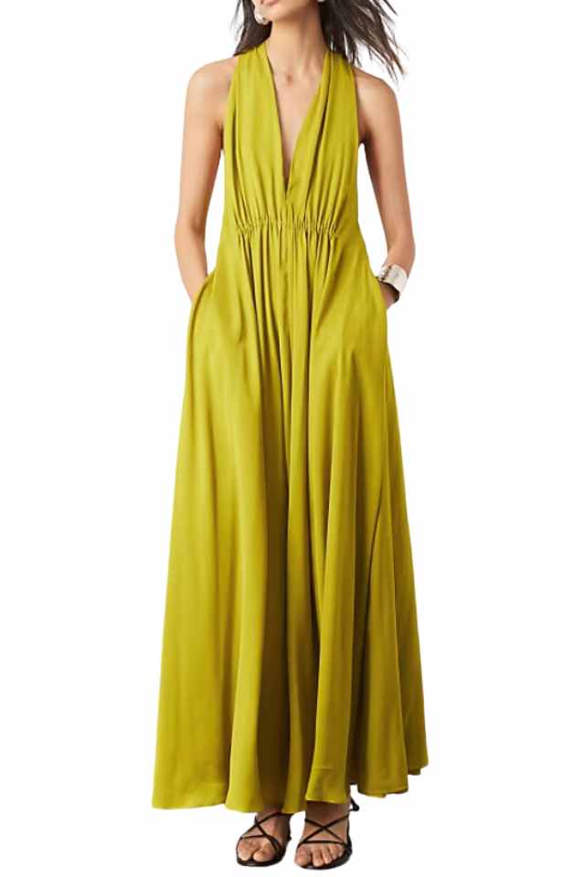
If you have been following here since the way back when, you know ASOS has always been in heavy rotation for me. Even as my style have evolved and my budget has changed (since starting this site as a 24 year old in San Francisco) ASOS has remained on my radar. Recently I have had so many good finds, evidenced by the three dresses above! I typically gravitation towards ASOS EDITION and ASOS LUXE but have found gems all over the site. In fact, I’m currently eyeing this beauty.
Right now the site is offering 25% off to the first 2,000 people to use the code SPEEDY at checkout. After that code expires you can still use SPEEDY at checkout for 20% off! Some exclusions do apply, but so many items are included. You can browse the full line up here and see more of my picks below…
.wpfi-post-images {
display: grid;
grid-gap: 15px;
grid-template-columns: repeat( auto-fit, minmax( 10px, auto ) );
}
.wpfi-post-images img {
display: block;
}
.wpfi-post-images–no-margin {
grid-gap: 0 !important;
}
@media( max-width: 1024px ) {
.wpfi-post-images–offset {
grid-template-columns: minmax( 10px, 1fr );
grid-gap: 25px;
}
.wpfi-post-images–offset > * {
width: 85%;
margin: 0 auto;
}
.wpfi-post-images–offset > *:first-child,
.wpfi-post-images–offset > *:last-child {
width: 55%;
}
.wpfi-post-images–offset > *:first-child {
margin-left: 0;
}
.wpfi-post-images–offset > *:last-child {
margin-right: 0;
}
}
@media( min-width: 1025px ) {
.wpfi-post-images–offset {
grid-template-columns: minmax( 10px, 4fr ) minmax( 10px, 7fr ) minmax( 10px, 4fr );
}
.wpfi-post-images–offset > *:last-child {
-webkit-align-self: flex-end;
align-self: flex-end;
}
.wpfi-post-images–staggered-columns div:nth-child( 3n-2 ),
.wpfi-post-images–staggered-columns a:nth-child( 3n-2 ) {
grid-column: 1 / span 2;
}
}
@media( max-width: 1024px ) {
#block-block_2ea44b726a5c6dc137f25e6f1b5b898e.wpfi-post-images:not( .wpfi-post-images–offset ) {
grid-template-columns: repeat( 2, 1fr);
}
}
@media( min-width: 1025px ) {
#block-block_2ea44b726a5c6dc137f25e6f1b5b898e.wpfi-post-images:not( .wpfi-post-images–offset ) {
grid-template-columns: repeat( 4, 1fr);
}
}
The post CURRENT ASOS FINDS appeared first on Atlantic-Pacific.


